PROJECT
graphic animated main title sequence
STREAMER
AppleTV+
STUDIO
Hello Sunshine
AppleTV+
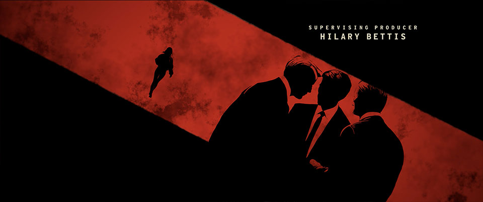
Shine designed, illustrated, edited, and animated the main title sequence for Lucky, the Apple TV+ series based on Marissa Stapley's best-selling novel. Inspired by the look of a gritty black-and-white graphic novel, the sequence follows Lucky as she moves through a series of elaborate cons, constantly evaluating the people around her in search of her next mark. A bold animated red line serves as the visual thread that connects each scene, guiding the viewer through her dangerous and unpredictable world.
The sequence was conceived as a fast-moving graphic narrative, using bold compositions and cinematic transitions to reveal Lucky's instincts, intelligence, and survival skills. Rather than relying on traditional character moments, each vignette becomes a visual metaphor for the way Lucky reads people, calculates risk, and disappears into her next identity. The striking contrast between stark black-and-white imagery and the vibrant red line creates a distinctive graphic language that is both elegant and suspenseful.


The creative process began with conceptual sketches created in Procreate on the iPad. Dozens of visual ideas were explored to discover the strongest graphic approach for introducing Lucky's character and the tone of the series. These early sketches established the visual storytelling, pacing, and transitions long before the final artwork was created.
Many different visual ideas were explored.

Once the visual direction was established, the illustrations were refined in Procreate and Adobe Photoshop into detailed black-and-white graphic artwork with a gritty, hand-crafted quality. The animated red line became the central storytelling device, weaving through each composition to connect one con to the next while visually representing Lucky's thought process as she identifies her next target.
The finished illustrations were edited into a storyboard animatic timed to the original music written and performed by the legendary Fiona Apple. This early board-o-matic established the rhythm, pacing, and emotional arc of the sequence, serving as the blueprint for the final animation.
The visual language of a graphic novel held the story.
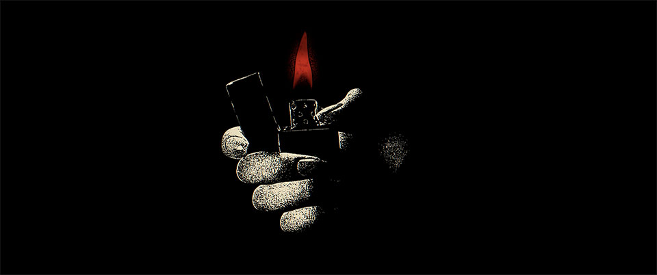


Locations from different episodes were featured in each shot.
The visual language of a graphic novel held the story.
Although the illustrations retain the appearance of flat graphic silhouettes, they were reconstructed in three-dimensional space using Cinema 4D. Individual elements were placed on separate layers of geometry, allowing the camera to travel dynamically through each scene. The combination of dimensional camera movement and graphic illustration transforms the artwork into a cinematic experience while preserving the bold simplicity of the original designs.
Procreate illustrations were created in layers then animated in 3D.
Multiple graphic layers were used to construct set pieces in 3D.
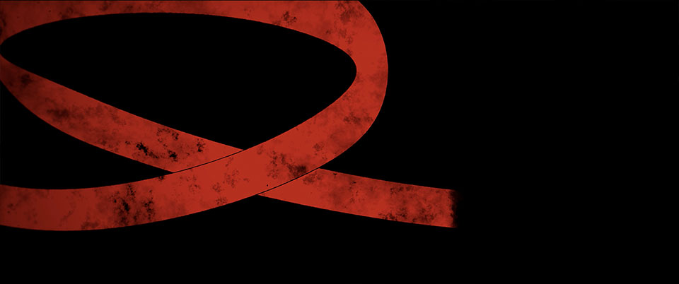
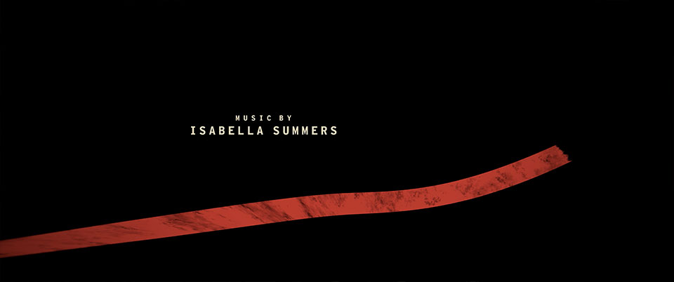
A single animated red line flows through the sequence, pulling the viewer from image to image with fluid, cinematic motion. As it weaves through each scene, the line becomes a visual metaphor for Lucky's path, connecting every con while revealing the quick instincts and calculated decisions that define her character.
The line follows a 3D spline through dimensional space.
Dimensional geometry was used to create each scene.
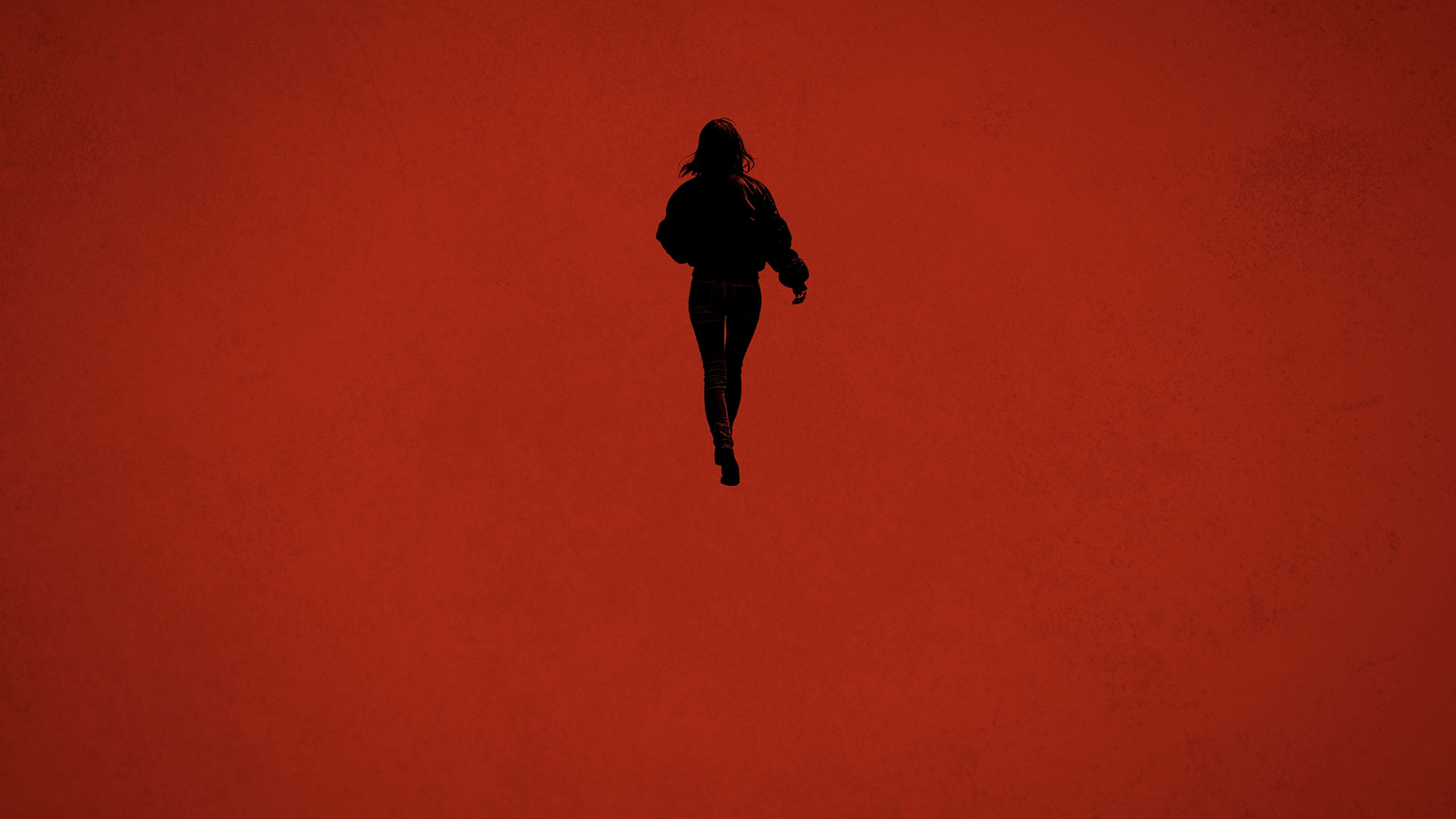
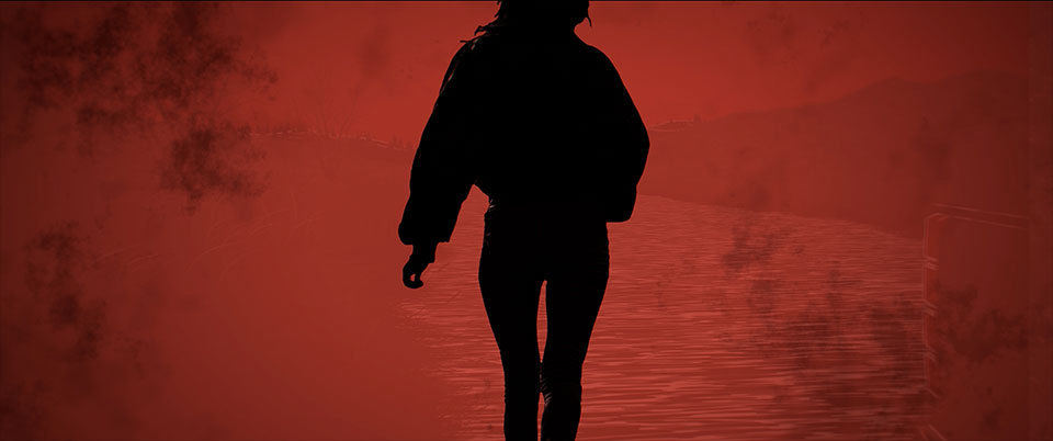
Lucky herself is portrayed as a bold black silhouette, allowing her iconic profile and body language to become instantly recognizable while reinforcing the sequence's graphic novel aesthetic.
The line leads the viewer to Lucky's silhouette in each scenario.
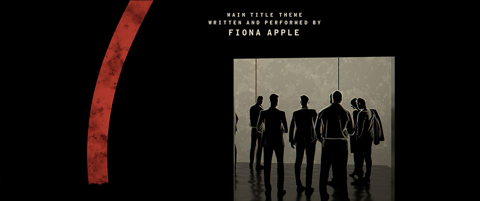



Each illustration was rebuilt as layered 3D geometry, allowing the camera to travel through the scenes with dramatic perspective and motion. This approach transformed static 2D silhouettes into dynamic graphic environments while maintaining the clean, graphic-novel aesthetic.
3D geometry was used to create more dynamic 2D animation.
Dimensional geometry was used to create each scene.
The sequence's crescendo visual motif is the ocean, an image inspired by pivotal events in the novel. Throughout the title sequence, water becomes both a symbolic and emotional element, representing danger, escape, memory, and transformation as Lucky's journey unfolds.
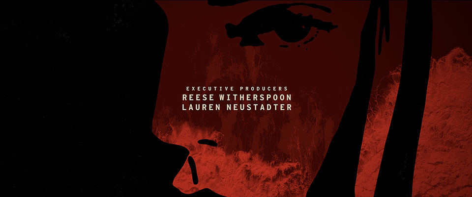
A graphic illustrated face of Lucky.
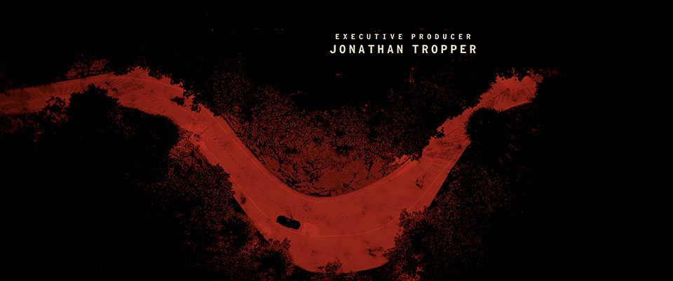
Images of California, like this aerial shot of the PCH, served as relevant visuals.

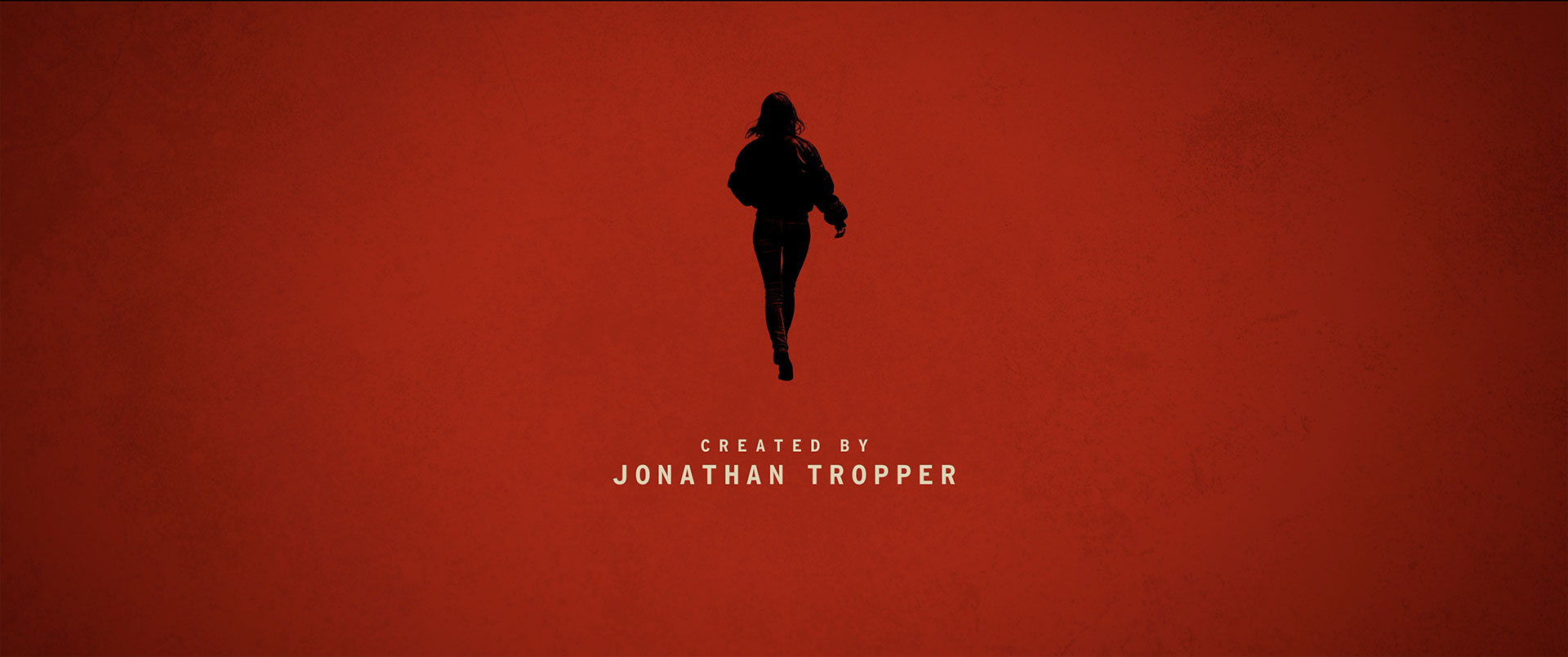
The sequence ends with a simple silhouette of Lucky.